To present the right brand image that is more in tune with the ethos of the Alafco brand.
To present the right brand image that is more in tune with the ethos of the Alafco brand. One which is more visually appealing, innovative whilst remaining usable and informative.
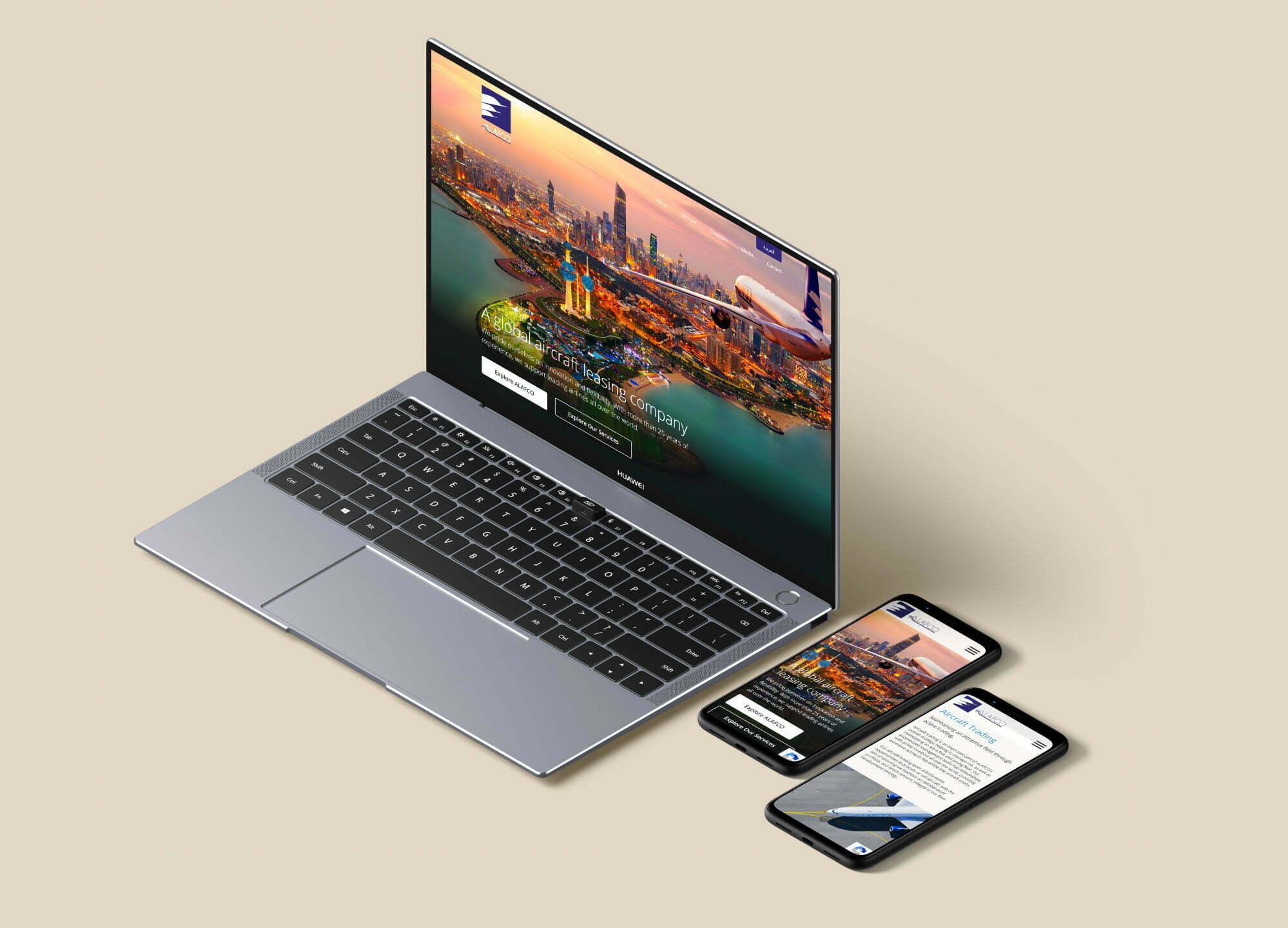
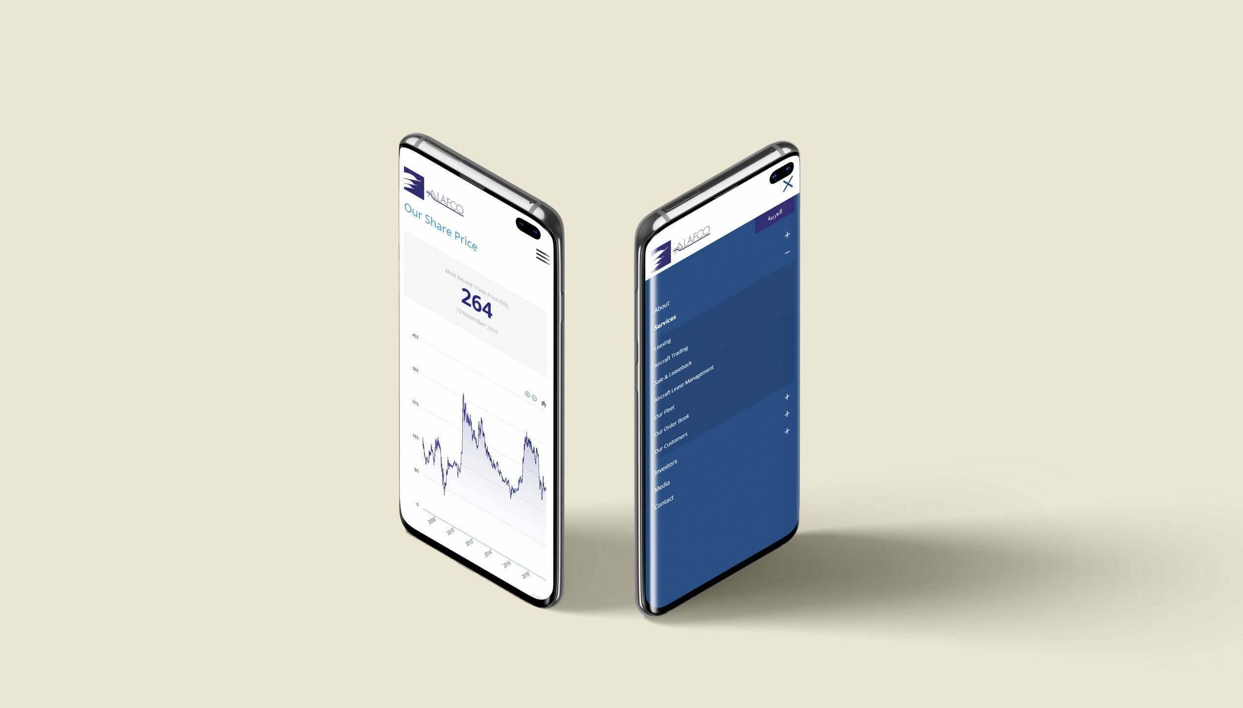
The Alafco website showcases a very clean design approach. This style of design is uncluttered and involves a lot of white space, which works very well with professional photography. It is very straightforward for site visitors to understand and it is an approach that is used prominently in modern aircraft leasing companies.
Wireframes
We created interactive wireframes during the design process. It allowed us to define the information hierarchy of Alafco’s design, making it easier to plan the layout according to how they wanted the user to process the content.
Our comprehensive style guide outlines the typography, colour palette and iconography. Formalising these key decisions enabled consistency of design both now and in future.
Our core aim was to design an site that was compelling towards their prospects. The goal was to create a intuitive design, that supports their new airline, brand values and messaging. Not only that, but the site needed to be multilingual, optimised for performance and built using a flexible framework for managing content and reports.
Other Projects
Warba Bank
A Corporate and Investment Bank based in Kuwait wanted an innovative internal training app to empower their non-sales staff to become brand and product ambassadors.
We use cookies to ensure that we give you the best experience on our website. If you continue to use this site we will assume that you are happy with it. See our privacy policy for more info.Ok